Sign Up Flow Redesign
Making it easier for small businesses to get started.
Redesigned the Sign Up flow to help SMBs connect their accounts faster and set up locations with less effort. The new experience is simpler, clearer, and built to guide users every step of the way.
Role
Senior UX Designer
Time Period
Q1–Q2 2025
Company
Uberall
Platform
Web Application
01 • Before & After
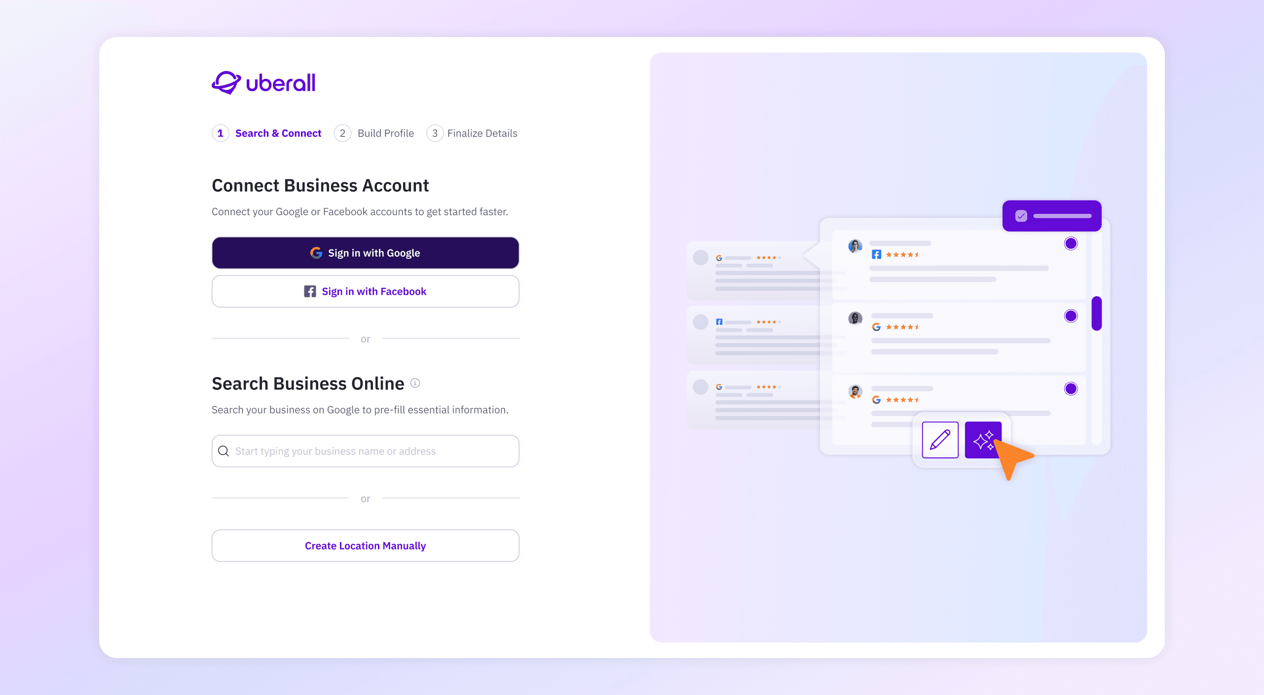
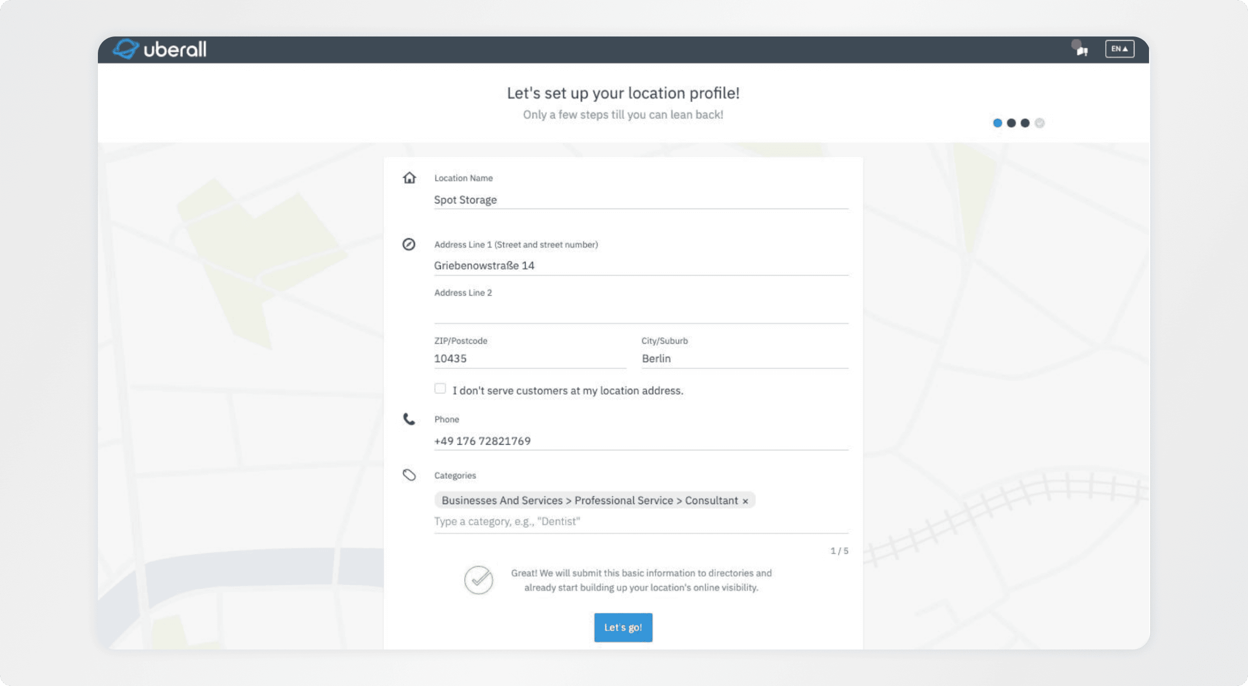
Solution
Signing Up
02 • Problem
A clunky sign up was turning users away.
The old Sign Up flow was slow, confusing, and outdated. Users had to manually fill out long forms with little help or guidance. Even when data was available through Google, it wasn’t used — creating extra steps and frustration.
Only 38%
of users completed the sign up
~30% churn
among SMBs
03 • Strategy
Make sign up simple, smart, and supportive.
I focused on simplifying the experience without losing flexibility. The goal was to help users move quickly from starting the flow to completing setup — with less friction and more guidance.
Let SSO do the heavy lifting
Use Google and Facebook connect to pre-fill data and skip manual entry.
Guided, not overwhelming
Break the flow into clear, focused steps that feel manageable.
Help users get unstuck
Use smart defaults, autocomplete, and clear explanations to reduce confusion.
Start simple, then expand
Ask only for the essentials up front. Offer more options after setup if needed.
04 • What I Did
#1 Research
Understanding where users got stuck
Mapped friction points through user testing, support insights, and competitor flows. Focused on confusion in search, missing fields, and unclear sync steps.
SUS 90.5
#2 Design & Testing
Simplifying the flow around user behavior
Redesigned the flow into 3 clear steps with lighter UI and smarter defaults. Iterated using Figma and Userlitics.
#3 Collaboration
Aligning fast with Product & Growth
Worked closely in weekly syncs to shape flows, validate edge cases, and move quickly. Used FigJam for flow mapping.
#4 Delivery & QA
Smooth handoff, built for dev speed
Prepped Figma with aliases, edge cases, and notes. Shared a video walkthrough and held a handover call ahead of dev start for async follow-up.
05 • Results
Reduced early friction in onboarding, significantly improving activation and helping SMBs reach value faster.
38% → 76%
Sign-up completion
43% less
Early-step drop-off
39% faster
Time to setup
Next Project
Location Profile Redesign
© 2026 Jane Sadovskaya - Senior Product Designer
Sign Up Flow Redesign
Making it easier for small businesses to get started.
Redesigned the Sign Up flow to help SMBs connect their accounts faster and set up locations with less effort. The new experience is simpler, clearer, and built to guide users every step of the way.
Role
Senior UX Designer
Time Period
Q1–Q2 2025
Company
Uberall
Platform
Web Application
01 / Before & After
01 • Before & After
Signing Up
02 / Problem
02 • Problem
A clunky sign up was turning users away.
The old Sign Up flow was slow, confusing, and outdated. Users had to manually fill out long forms with little help or guidance. Even when data was available through Google, it wasn’t used — creating extra steps and frustration.
Only 38%
of users completed the sign up
~30% churn
among SMBs
03 / Strategy
03 • Strategy
Make sign up simple, smart, and supportive.
Make sign up simple, smart, and supportive.
I focused on simplifying the experience without losing flexibility. The goal was to help users move quickly from starting the flow to completing setup — with less friction and more guidance.
Let SSO do the heavy lifting
Use Google and Facebook connect to pre-fill data and skip manual entry.
Guided, not overwhelming
Break the flow into clear, focused steps that feel manageable.
Help users get unstuck
Use smart defaults, autocomplete, and clear explanations to reduce confusion.
Start simple, then expand
Ask only for the essentials up front. Offer more options after setup if needed.
04 / What I Did
04 • What I Did
#1 Research
Understanding where users got stuck
Mapped friction points through user testing, support insights, and competitor flows. Focused on confusion in search, missing fields, and unclear sync steps.
SUS 90.5
#2 Design & Testing
Simplifying the flow around user behavior
Redesigned the flow into 3 clear steps with lighter UI and smarter defaults. Iterated using Figma and Userlitics.
#3 Collaboration
Aligning fast with Product & Growth
Worked closely in weekly syncs to shape flows, validate edge cases, and move quickly. Used FigJam for flow mapping.
#4 Delivery & QA
Smooth handoff, built for dev speed
Prepped Figma with aliases, edge cases, and notes. Shared a video walkthrough and held a handover call ahead of dev start for async follow-up.
05 / Results (wip)
05 • Results
Since launch, adoption stabilized (+2.3%) and engagement time improved (+1.8%). Drop-off in early steps was reduced after UI updates. The flow is now stable and ready to scale with future campaigns.
Since launch, adoption stabilized (+38%). Drop-off in early steps was reduced after UI updates. The flow is now stable and ready to scale with future campaigns.
Reduced early friction in onboarding, significantly improving activation and helping SMBs reach value faster.
38% → 76%
Sign-up completion
43% less
Early-step drop-off
39% faster
Time to setup
© 2026 Jane Sadovskaya - Senior Product Designer